
Apr 10, 2024
Accessibility in Design: Designing for Everyone
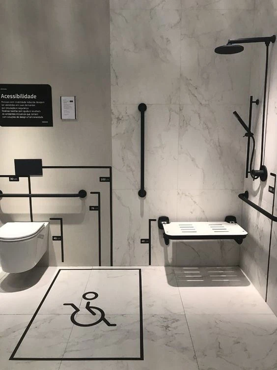
Accessibility is a cornerstone of modern design, ensuring that people of all abilities can interact with our product or content without barriers.
Accessibility
Medium Blog
Recent
About
In this blog, I explore how accessibility in design isn't just about meeting standards but creating experiences that are truly inclusive. By making small yet impactful changes, I aim to show how we can enhance usability for all users, ensuring that everyone can interact with our digital products with ease.
Designing with accessibility in mind involves considering users with visual, auditory, motor, or cognitive challenges. For instance, using readable fonts, providing keyboard navigation, and incorporating assistive text for images helps improve usability for everyone. Accessibility is not just about compliance with standards like WCAG; it’s about embracing inclusivity to reach a broader audience.
One of the most overlooked aspects of accessibility is color contrast. Many users, such as those with color blindness, rely on sufficient contrast to differentiate between elements. Avoid using color as the sole method to convey information—supplement it with text or patterns. Another critical aspect is creating adaptable layouts that work seamlessly across devices. A mobile-friendly design with accessible touch targets, for example, benefits both users with mobility challenges and those on the go.
By integrating accessibility into your workflow, you also boost the overall quality of your design. Features like captions, clear navigation, and simplified layouts improve user experience for everyone. Begin with small steps: conduct usability tests with diverse users, leverage accessibility checkers, and educate your team on inclusive practices. Accessibility is a win-win—it fosters equality while enhancing your design’s impact.
Because Everyone Deserves a Great Experience

Why Accessibility Matters
It’s not just about meeting guidelines. it’s about real people. Some users rely on screen readers, others navigate using only a keyboard, and some need high-contrast colors to read text clearly. When we design with inclusivity in mind, we’re creating experiences that welcome everyone, not just a select few.
Small Tweaks, Big Impact
Making design accessible doesn’t have to be complicated. Here are a few simple ways to start:
Text that’s easy to read – No one likes squinting. Use clear fonts and good contrast.
Keyboard-friendly navigation – Not everyone uses a mouse; make sure your site works with just a keyboard.
Alt text for images – Screen readers need descriptions to tell visually impaired users what’s there.
Don’t rely on color alone – Not everyone sees color the same way, so add patterns, labels, or other cues.

Designing for Everyone = Better Design for All
When we make things more accessible, we make them better for everyone. Good contrast helps people in bright sunlight. Subtitles help those watching videos on mute. Clear navigation helps users of all abilities find what they need faster.
At the end of the day, accessibility isn’t about rules—it’s about people. And as designers, isn’t that who we’re designing for in the first place?


Apr 10, 2024
Accessibility in Design: Designing for Everyone
Accessibility is a cornerstone of modern design, ensuring that people of all abilities can interact with our product or content without barriers.
Accessibility
Medium Blog
Recent
About
In this blog, I explore how accessibility in design isn't just about meeting standards but creating experiences that are truly inclusive. By making small yet impactful changes, I aim to show how we can enhance usability for all users, ensuring that everyone can interact with our digital products with ease.
Designing with accessibility in mind involves considering users with visual, auditory, motor, or cognitive challenges. For instance, using readable fonts, providing keyboard navigation, and incorporating assistive text for images helps improve usability for everyone. Accessibility is not just about compliance with standards like WCAG; it’s about embracing inclusivity to reach a broader audience.
One of the most overlooked aspects of accessibility is color contrast. Many users, such as those with color blindness, rely on sufficient contrast to differentiate between elements. Avoid using color as the sole method to convey information—supplement it with text or patterns. Another critical aspect is creating adaptable layouts that work seamlessly across devices. A mobile-friendly design with accessible touch targets, for example, benefits both users with mobility challenges and those on the go.
By integrating accessibility into your workflow, you also boost the overall quality of your design. Features like captions, clear navigation, and simplified layouts improve user experience for everyone. Begin with small steps: conduct usability tests with diverse users, leverage accessibility checkers, and educate your team on inclusive practices. Accessibility is a win-win—it fosters equality while enhancing your design’s impact.
Because Everyone Deserves a Great Experience
Why Accessibility Matters
It’s not just about meeting guidelines. it’s about real people. Some users rely on screen readers, others navigate using only a keyboard, and some need high-contrast colors to read text clearly. When we design with inclusivity in mind, we’re creating experiences that welcome everyone, not just a select few.
Small Tweaks, Big Impact
Making design accessible doesn’t have to be complicated. Here are a few simple ways to start:
Text that’s easy to read – No one likes squinting. Use clear fonts and good contrast.
Keyboard-friendly navigation – Not everyone uses a mouse; make sure your site works with just a keyboard.
Alt text for images – Screen readers need descriptions to tell visually impaired users what’s there.
Don’t rely on color alone – Not everyone sees color the same way, so add patterns, labels, or other cues.
Designing for Everyone = Better Design for All
When we make things more accessible, we make them better for everyone. Good contrast helps people in bright sunlight. Subtitles help those watching videos on mute. Clear navigation helps users of all abilities find what they need faster.
At the end of the day, accessibility isn’t about rules—it’s about people. And as designers, isn’t that who we’re designing for in the first place?