Crafting Clarity and Trust - Matrimony
Jeevansathi, a cornerstone of Indian matrimonial services, faced a critical challenge: its pricing page wasn't effectively converting users into premium members. This wasn't just about numbers; it was about the deeply personal journey of finding a life partner. Users were navigating a complex decision, and our mission was to create an experience that felt clear, trustworthy, and supportive.
Challenge
Untangling Complexity and Building Trust
The existing pricing page was a source of confusion and anxiety for users. Key pain points included:
Plan Overwhelm: Comparing plans was like deciphering a complex code. Users struggled to understand the value of each tier.
Trust Deficit: Concerns about payment security and hidden costs created hesitation.
Decision Paralysis: The sheer number of options and unclear benefits led to indecision.
Missed Opportunities: Valuable add-ons were buried, failing to enhance the user's experienc
Research & Insights
Increase in time spent on writing reviews & feedbacks
This project wasn't about assumptions; it was about understanding real people. We employed a multi-faceted research approach:
User Interviews & Usability Testing: We sat with users, observed their behavior, and listened to their concerns. The emotional weight of their decision was palpable. They craved reassurance and clarity.
Heatmap Analysis: We tracked user interactions, revealing areas of confusion and hesitation. The data confirmed our qualitative findings.
Customer Support Logs: We analyzed real user queries, identifying recurring pain points and frustrations.
Competitive Benchmarking: We dissected the pricing strategies of leading platforms like Atlassian and Instapage, identifying patterns of success.
User Personas: We developed detailed personas to represent our core user groups, ensuring our design decisions were grounded in empathy.
Key Insights:
Users needed a clear, side-by-side comparison of plans.
Trust was paramount, requiring visible security indicators and social proof.
Personalization was key, with users responding positively to tailored add-on suggestions.
Users needed to see the total cost of the purchase at all times.
Crafting a Solution:
Our design process was iterative and user-centered:
Information Architecture:
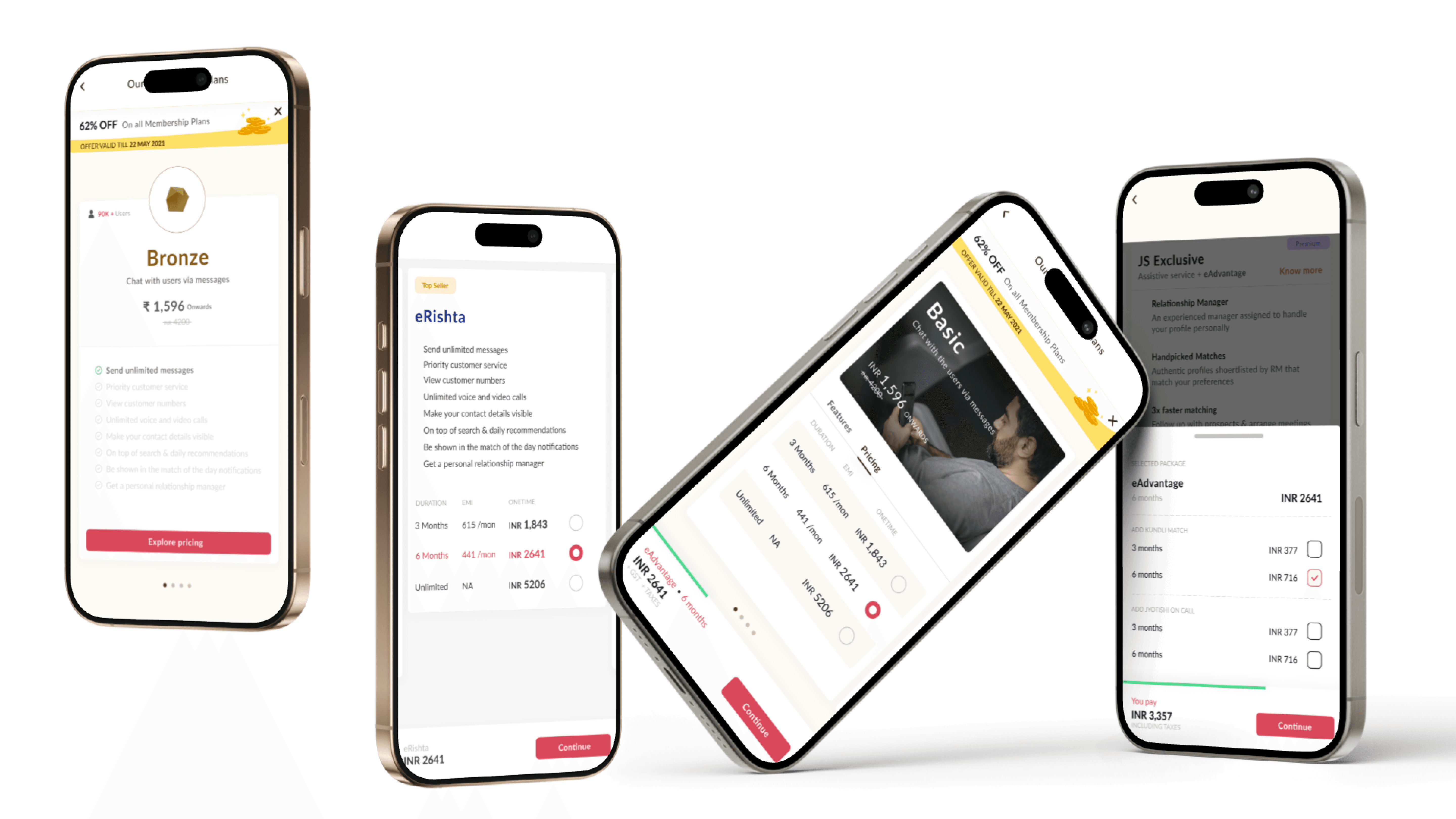
We restructured the page, prioritizing clarity and ease of navigation.
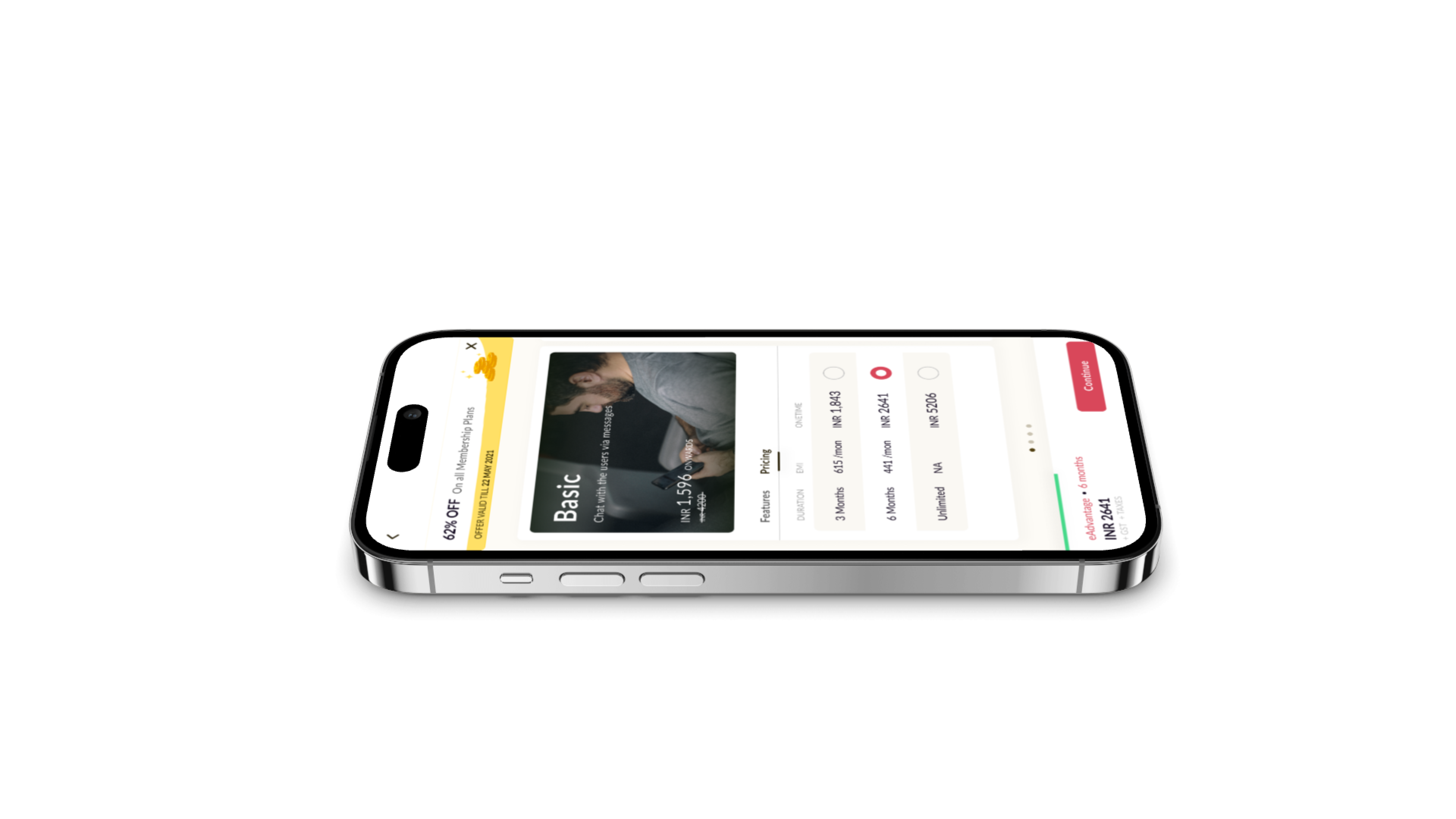
We implemented a side-by-side comparison table, allowing users to quickly identify key differences between plans.
We added a sticky footer to always display the total cost.
User Flow Optimization:
We transformed the user flow from a confusing maze to a guided journey.
We implemented a progressive disclosure approach, allowing users to select a plan before exploring add-ons.
Old flow 1. Landing Page -> 2. Pricing Selection -> 3. Payment.
New Flow 1. Select a Plan -> 2. Choose Add-ons -> 3. Secure Checkout.
UI Iterations:
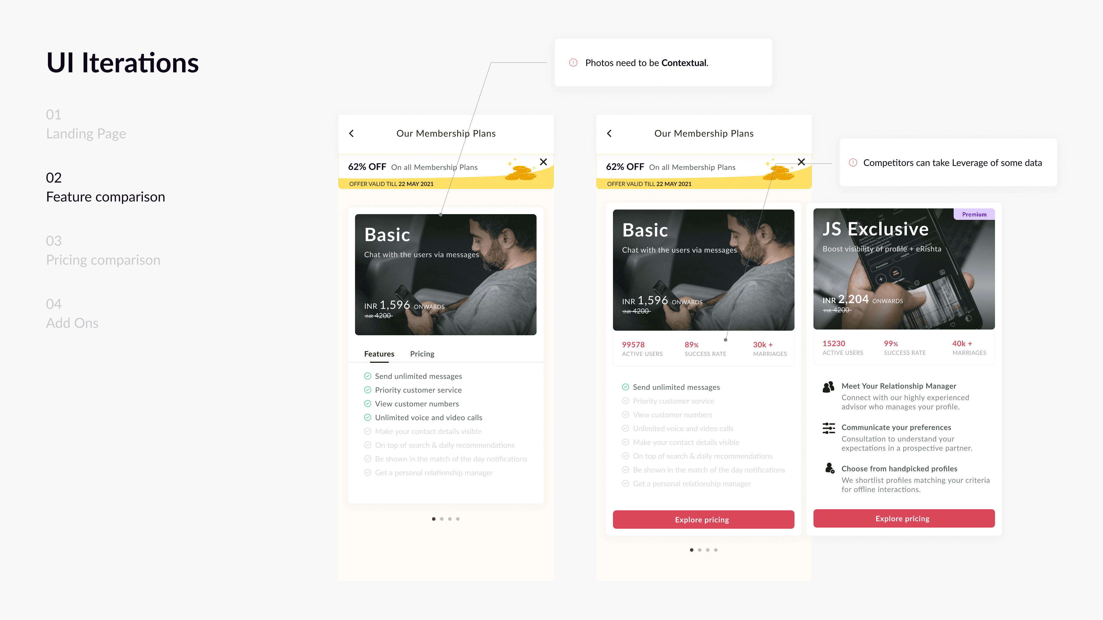
We moved from flat, static designs to dynamic, engaging interfaces.
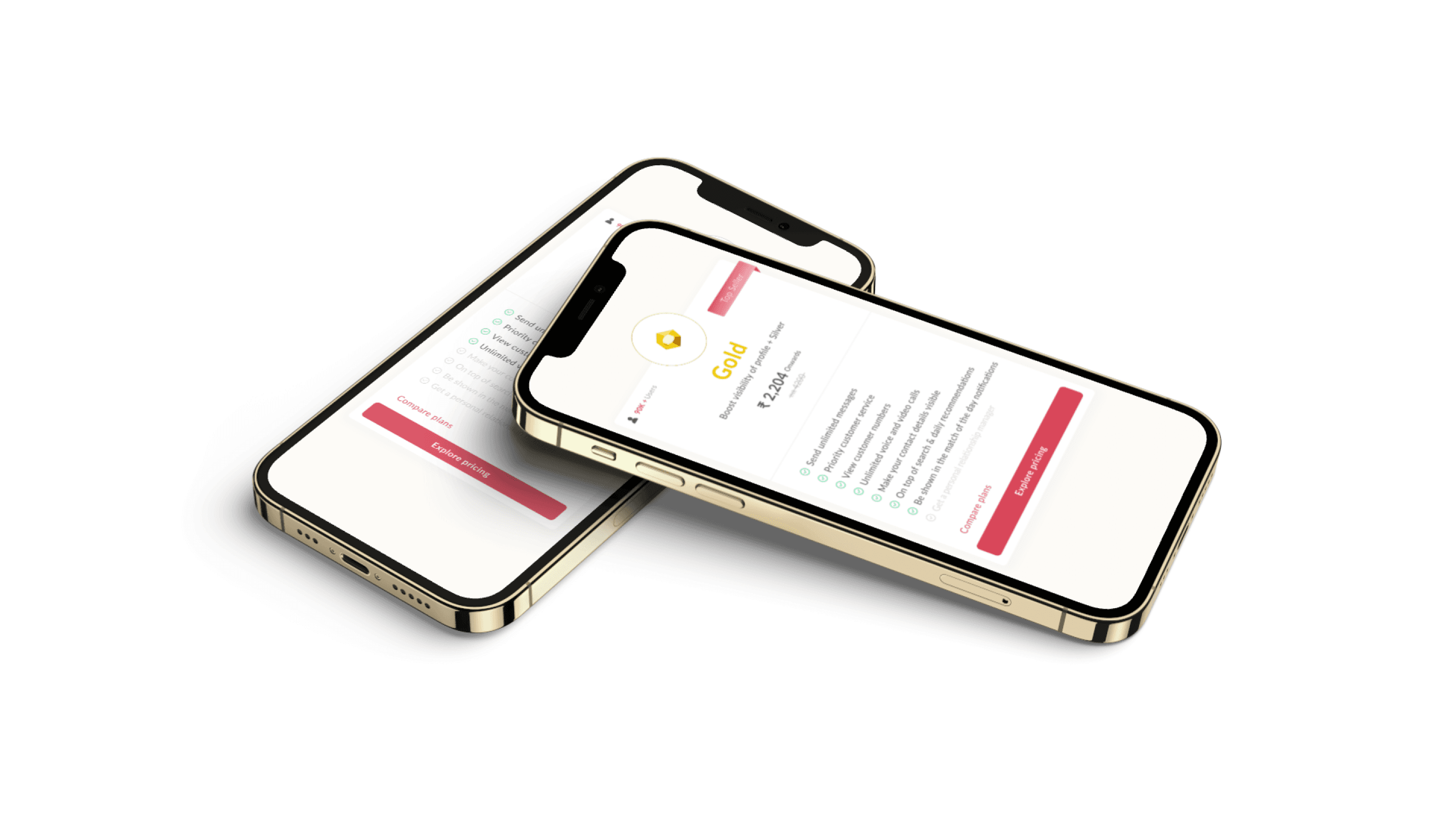
We incorporated trust signals, such as user testimonials and security badges.
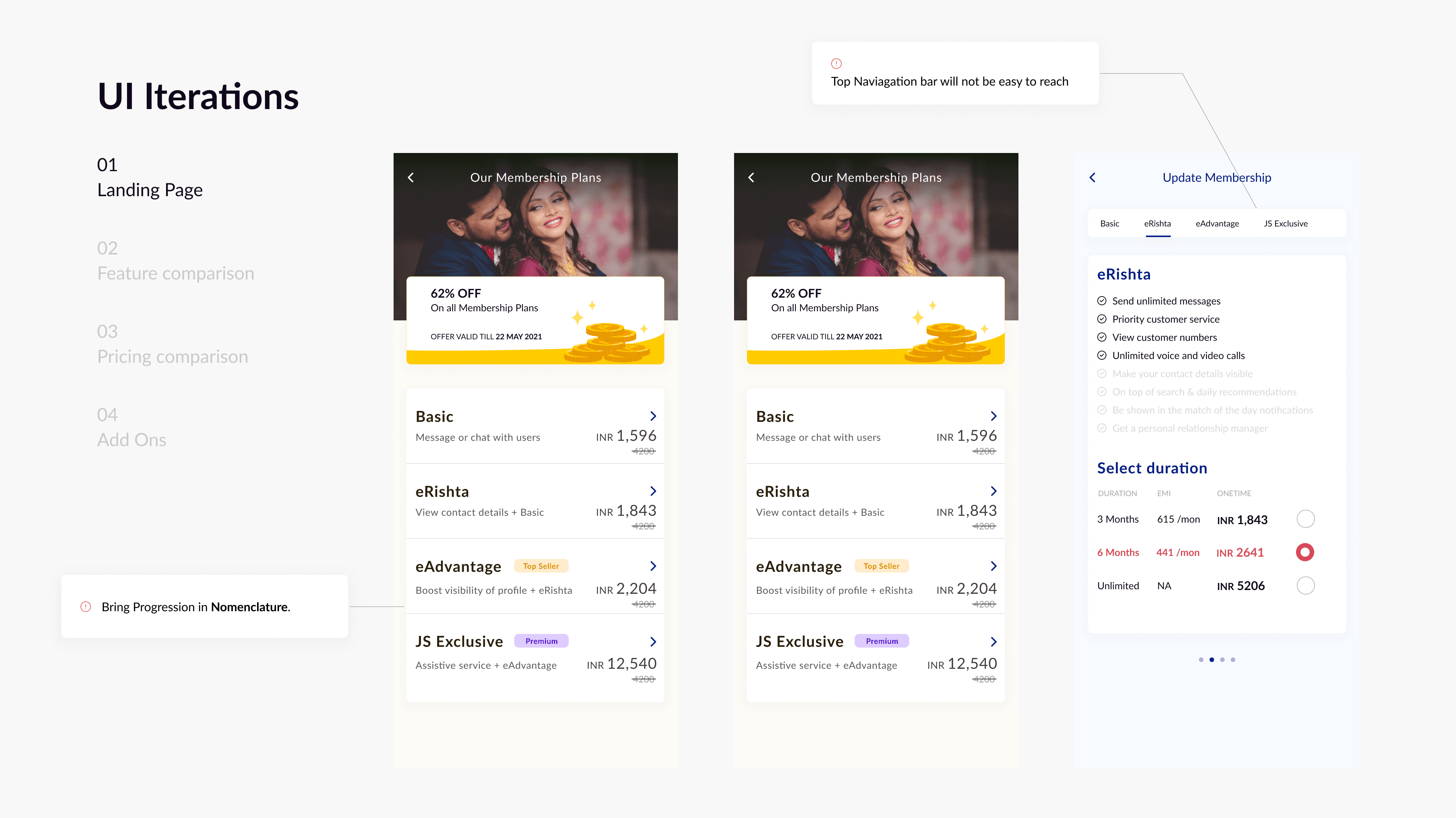
We used simple plan names such as Bronze, Silver, and Gold.
We added a frequently bought together section.
Psychological Design:
We used anchoring and the decoy effect to guide users toward optimal choices.
We incorporated social proof, such as active user counts and success rates, to build trust.
We used clear, concise language to reduce cognitive load.
Key Insights:
Users needed a clear, side-by-side comparison of plans.
Trust was paramount, requiring visible security indicators and social proof.
Personalization was key, with users responding positively to tailored add-on suggestions.
Users needed to see the total cost of the purchase at all times.
Results & Key Takeaways
Results & Key Takeaways
The redesigned pricing page delivered significant results:
Increased Conversions: Plan selections rose by 35%, and checkout conversions increased by 22%.
Enhanced Trust: Users felt more confident in their purchase, leading to a 18% drop in cart abandonment.
Improved User Engagement: Users spent more time comparing plans, indicating a more informed decision-making process.
Key Learnings:
Clarity and transparency are essential for building trust and driving conversions.
User research is the foundation of effective UX design.
Psychological principles can be powerful tools for influencing user behavior.
Iterative design and testing are crucial for continuous improvement.
Conclusion:
This project reinforced the power of user-centered design. By understanding the emotional and practical needs of our users, we created a pricing page that felt intuitive, trustworthy, and supportive. We didn't just redesign a page; we transformed a critical touchpoint in the user's journey, helping them take a confident step toward finding their life partner.
Other Projects
Other Projects
Crafting Clarity and Trust - Matrimony
Jeevansathi, a cornerstone of Indian matrimonial services, faced a critical challenge: its pricing page wasn't effectively converting users into premium members. This wasn't just about numbers; it was about the deeply personal journey of finding a life partner. Users were navigating a complex decision, and our mission was to create an experience that felt clear, trustworthy, and supportive.
Challenge
Untangling Complexity and Building Trust
The existing pricing page was a source of confusion and anxiety for users. Key pain points included:
Plan Overwhelm: Comparing plans was like deciphering a complex code. Users struggled to understand the value of each tier.
Trust Deficit: Concerns about payment security and hidden costs created hesitation.
Decision Paralysis: The sheer number of options and unclear benefits led to indecision.
Missed Opportunities: Valuable add-ons were buried, failing to enhance the user's experienc
Research & Insights
Increase in time spent on writing reviews & feedbacks
This project wasn't about assumptions; it was about understanding real people. We employed a multi-faceted research approach:
User Interviews & Usability Testing: We sat with users, observed their behavior, and listened to their concerns. The emotional weight of their decision was palpable. They craved reassurance and clarity.
Heatmap Analysis: We tracked user interactions, revealing areas of confusion and hesitation. The data confirmed our qualitative findings.
Customer Support Logs: We analyzed real user queries, identifying recurring pain points and frustrations.
Competitive Benchmarking: We dissected the pricing strategies of leading platforms like Atlassian and Instapage, identifying patterns of success.
User Personas: We developed detailed personas to represent our core user groups, ensuring our design decisions were grounded in empathy.
Key Insights:
Users needed a clear, side-by-side comparison of plans.
Trust was paramount, requiring visible security indicators and social proof.
Personalization was key, with users responding positively to tailored add-on suggestions.
Users needed to see the total cost of the purchase at all times.
Crafting a Solution:
Our design process was iterative and user-centered:
Information Architecture:
We restructured the page, prioritizing clarity and ease of navigation.
We implemented a side-by-side comparison table, allowing users to quickly identify key differences between plans.
We added a sticky footer to always display the total cost.
User Flow Optimization:
We transformed the user flow from a confusing maze to a guided journey.
We implemented a progressive disclosure approach, allowing users to select a plan before exploring add-ons.
Old flow 1. Landing Page -> 2. Pricing Selection -> 3. Payment.
New Flow 1. Select a Plan -> 2. Choose Add-ons -> 3. Secure Checkout.
UI Iterations:
We moved from flat, static designs to dynamic, engaging interfaces.
We incorporated trust signals, such as user testimonials and security badges.
We used simple plan names such as Bronze, Silver, and Gold.
We added a frequently bought together section.
Psychological Design:
We used anchoring and the decoy effect to guide users toward optimal choices.
We incorporated social proof, such as active user counts and success rates, to build trust.
We used clear, concise language to reduce cognitive load.
Key Insights:
Users needed a clear, side-by-side comparison of plans.
Trust was paramount, requiring visible security indicators and social proof.
Personalization was key, with users responding positively to tailored add-on suggestions.
Users needed to see the total cost of the purchase at all times.
Results & Key Takeaways
The redesigned pricing page delivered significant results:
Increased Conversions: Plan selections rose by 35%, and checkout conversions increased by 22%.
Enhanced Trust: Users felt more confident in their purchase, leading to a 18% drop in cart abandonment.
Improved User Engagement: Users spent more time comparing plans, indicating a more informed decision-making process.
Key Learnings:
Clarity and transparency are essential for building trust and driving conversions.
User research is the foundation of effective UX design.
Psychological principles can be powerful tools for influencing user behavior.
Iterative design and testing are crucial for continuous improvement.
Conclusion:
This project reinforced the power of user-centered design. By understanding the emotional and practical needs of our users, we created a pricing page that felt intuitive, trustworthy, and supportive. We didn't just redesign a page; we transformed a critical touchpoint in the user's journey, helping them take a confident step toward finding their life partner.
Other Projects