
Overview
Scaler Refresh was a redesign project aimed at enhancing the learning experience and engagement on the Scaler Academy platform. The project focused on improving user flow, accessibility, and visual hierarchy to increase website traffic and user conversions by 15%. Key areas of improvement included a redesigned landing page, an intuitive dashboard, personalized student profiles, and dark mode integration.
Simplified UX, Amplified Learning.
This case study focuses on the redesign of the Scaler Learning Portal, a project undertaken by Manas Mradul as a graduation project at the National Institute of Fashion Technology (NIFT), Gandhinagar, in collaboration with Scaler by InterviewBit. The project aimed to enhance the user experience of the learning portal through intangible, user-centric interventions.
Goal: Increase engagement and conversion rates on the Scaler platform by 15% through an improved user experience and interface.
Target Audience: Engineers aged 18-28, looking for career growth or hiring opportunities.
Role: UX/UI Design Intern in Team
Key Deliverables:
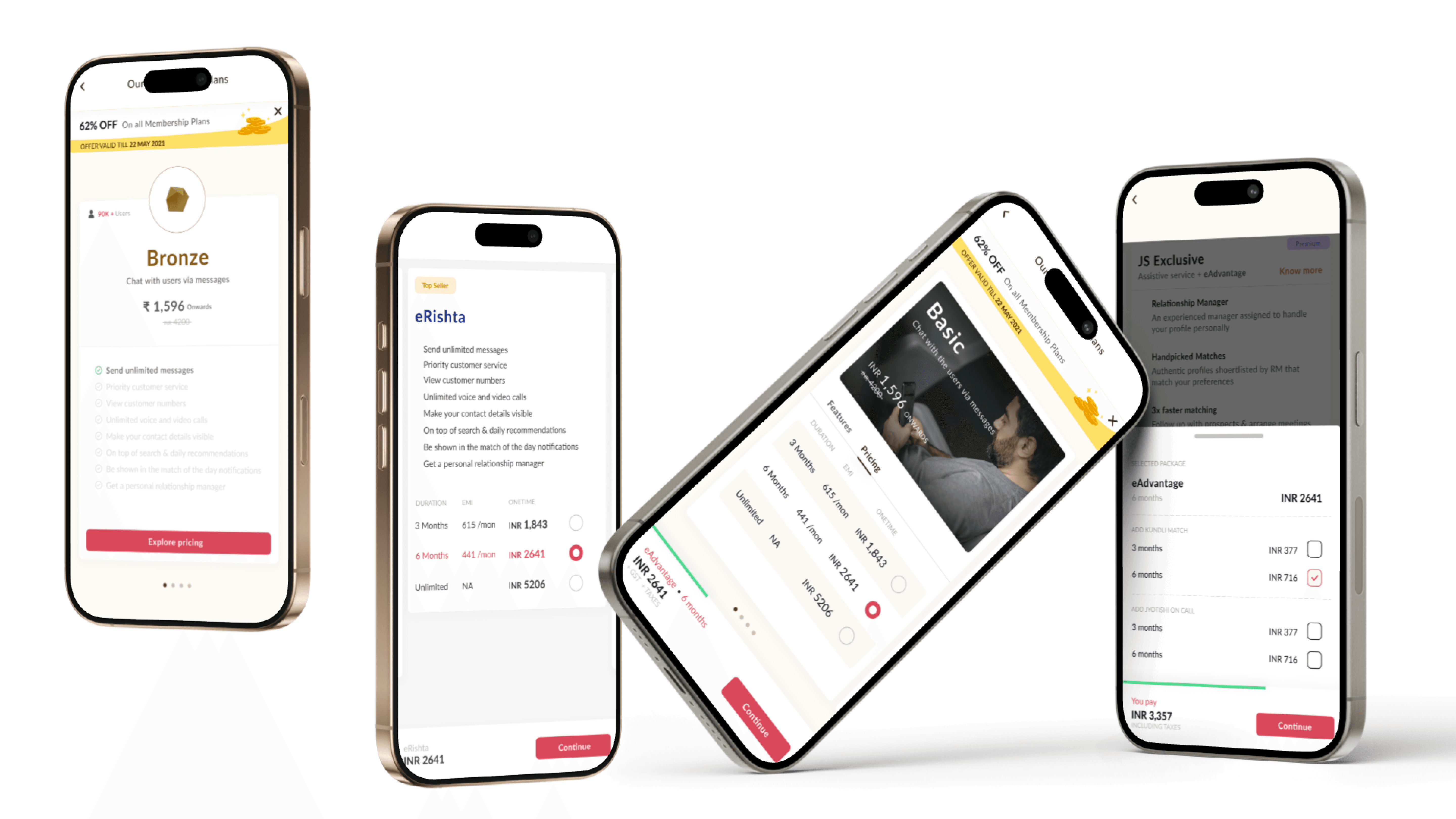
Redesigned Landing Page
Enhanced Dashboard UI
Personalized Student Profile UI
New Mailer UI & Communication System
Dark Mode Implementation
UX Flow Improvements for Seamless Navigation

Problem Statement
Increase in time spent on writing reviews & feedbacks
The primary challenge was to improve the user interface and user experience of the Scaler Learning Portal, ensuring it resonated with the target audience and aligned with Scaler's brand identity. Specific issues identified included:
Visual Clarity in Dark Mode: Text and objects were not always clearly visible in the dark mode implementation.
Color Saturation: Certain elements, like call-to-action (CTA) buttons, had overly saturated colors, causing visual discomfort.
Form Background Issues: The background of forms in dark mode presented visibility problems.
Overall User Engagement: The portal needed a more engaging and intuitive design to enhance user retention and interaction.
Business Impact
A suboptimal user experience was directly affecting conversion rates, with many potential learners exploring the platform but not enrolling in courses. The challenge was to reduce friction and improve engagement.


Strategy & Design Approach
The design process was a structured, user-centric approach, incorporating:
Research and Analysis:
Competitive analysis of dark mode implementations in other educational platforms like BYJU'S, Vedantu, and Lido Learning. This helped identify best practices and potential pitfalls.
User feedback analysis (though not explicitly detailed, the focus on user-centric design implies this).
The project was conducted from the 12th of January 2021 to the 17th of May 2021.
Design Exploration:
Development of a new color palette, particularly for dark mode, focusing on accessibility and visual comfort.
Creation of hi-fidelity mockups for both light and dark modes, addressing issues with card colors, text colors, and banner colors.
Implementation and Refinement:
Focus on achieving proper contrast ratios for text and background, adhering to accessibility standards.
Iterative design process, refining elements based on feedback and analysis.
The creation of a cohesive dark mode, that was a key feature of this project.
Data Insights and Solutions
Dark Mode Challenges:
Problem: Text and objects lacked clarity.
Solution: Adjusted color contrasts, ensuring a minimum ratio of 4.5:1 for text on background.
Problem: Form backgrounds were problematic.
Solution: Revised background colors to improve visibility and reduce visual noise.
Color Saturation:
Problem: Overly bright CTA buttons.
Solution: Modified color codes to reduce saturation, creating a more pleasing visual experience.
Color Pallete:
Implementation of the color codes #141414 for background color, #FFFFFF and #E3AFE7 or #FF6D06 or #78CBFF depending on the element for text colors within the dark mode.
Card and Banner colors were also modified for both light and dark mode.
Competitor Analysis:
The analysis of competitors dark modes, showed areas of improvement for Scaler.

Final Results & Impact
Final Results & Impact
Key Outcomes
11% increase in website traffic & registrations.
35% decrease in bounce rates on the landing page.
More personalized learning paths leading to higher retention.
Positive user feedback on UI clarity and dark mode experience.
Improved visual clarity and accessibility in dark mode.
Enhanced user experience through refined color palettes and design elements.
A more cohesive and user-friendly learning portal.
Learnings and Conclusion
This project highlighted the importance of:
Thorough competitive analysis in identifying design opportunities.
Prioritizing accessibility and visual comfort in UI design.
The impact of color palettes and contrast ratios on user experience.
The importance of user-centric design within educational platforms
The project was submitted as a Graduation project report for the
Department Of Fashion & Lifestyle Accessories (F&LA) at NIFT Gandhinagar.
Other Projects
Other Projects
Overview
Scaler Refresh was a redesign project aimed at enhancing the learning experience and engagement on the Scaler Academy platform. The project focused on improving user flow, accessibility, and visual hierarchy to increase website traffic and user conversions by 15%. Key areas of improvement included a redesigned landing page, an intuitive dashboard, personalized student profiles, and dark mode integration.
Simplified UX, Amplified Learning.
This case study focuses on the redesign of the Scaler Learning Portal, a project undertaken by Manas Mradul as a graduation project at the National Institute of Fashion Technology (NIFT), Gandhinagar, in collaboration with Scaler by InterviewBit. The project aimed to enhance the user experience of the learning portal through intangible, user-centric interventions.
Goal: Increase engagement and conversion rates on the Scaler platform by 15% through an improved user experience and interface.
Target Audience: Engineers aged 18-28, looking for career growth or hiring opportunities.
Role: UX/UI Design Intern in Team
Key Deliverables:
Redesigned Landing Page
Enhanced Dashboard UI
Personalized Student Profile UI
New Mailer UI & Communication System
Dark Mode Implementation
UX Flow Improvements for Seamless Navigation
Problem Statement
Increase in time spent on writing reviews & feedbacks
The primary challenge was to improve the user interface and user experience of the Scaler Learning Portal, ensuring it resonated with the target audience and aligned with Scaler's brand identity. Specific issues identified included:
Visual Clarity in Dark Mode: Text and objects were not always clearly visible in the dark mode implementation.
Color Saturation: Certain elements, like call-to-action (CTA) buttons, had overly saturated colors, causing visual discomfort.
Form Background Issues: The background of forms in dark mode presented visibility problems.
Overall User Engagement: The portal needed a more engaging and intuitive design to enhance user retention and interaction.
Business Impact
A suboptimal user experience was directly affecting conversion rates, with many potential learners exploring the platform but not enrolling in courses. The challenge was to reduce friction and improve engagement.
Strategy & Design Approach
The design process was a structured, user-centric approach, incorporating:
Research and Analysis:
Competitive analysis of dark mode implementations in other educational platforms like BYJU'S, Vedantu, and Lido Learning. This helped identify best practices and potential pitfalls.
User feedback analysis (though not explicitly detailed, the focus on user-centric design implies this).
The project was conducted from the 12th of January 2021 to the 17th of May 2021.
Design Exploration:
Development of a new color palette, particularly for dark mode, focusing on accessibility and visual comfort.
Creation of hi-fidelity mockups for both light and dark modes, addressing issues with card colors, text colors, and banner colors.
Implementation and Refinement:
Focus on achieving proper contrast ratios for text and background, adhering to accessibility standards.
Iterative design process, refining elements based on feedback and analysis.
The creation of a cohesive dark mode, that was a key feature of this project.
Data Insights and Solutions
Dark Mode Challenges:
Problem: Text and objects lacked clarity.
Solution: Adjusted color contrasts, ensuring a minimum ratio of 4.5:1 for text on background.
Problem: Form backgrounds were problematic.
Solution: Revised background colors to improve visibility and reduce visual noise.
Color Saturation:
Problem: Overly bright CTA buttons.
Solution: Modified color codes to reduce saturation, creating a more pleasing visual experience.
Color Pallete:
Implementation of the color codes #141414 for background color, #FFFFFF and #E3AFE7 or #FF6D06 or #78CBFF depending on the element for text colors within the dark mode.
Card and Banner colors were also modified for both light and dark mode.
Competitor Analysis:
The analysis of competitors dark modes, showed areas of improvement for Scaler.
Final Results & Impact
Key Outcomes
11% increase in website traffic & registrations.
35% decrease in bounce rates on the landing page.
More personalized learning paths leading to higher retention.
Positive user feedback on UI clarity and dark mode experience.
Improved visual clarity and accessibility in dark mode.
Enhanced user experience through refined color palettes and design elements.
A more cohesive and user-friendly learning portal.
Learnings and Conclusion
This project highlighted the importance of:
Thorough competitive analysis in identifying design opportunities.
Prioritizing accessibility and visual comfort in UI design.
The impact of color palettes and contrast ratios on user experience.
The importance of user-centric design within educational platforms
The project was submitted as a Graduation project report for the
Department Of Fashion & Lifestyle Accessories (F&LA) at NIFT Gandhinagar.
Other Projects